Markham Method
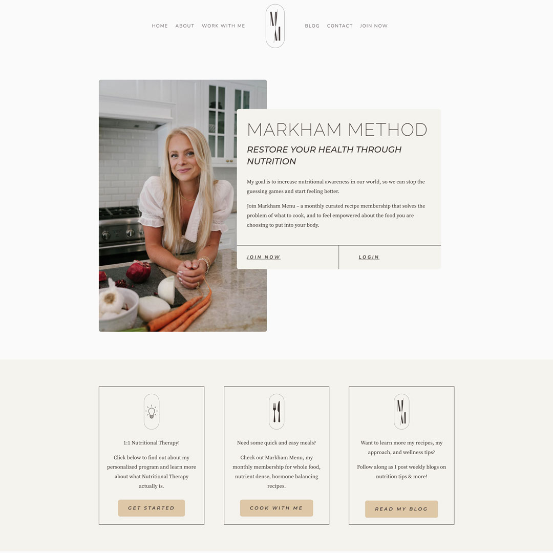
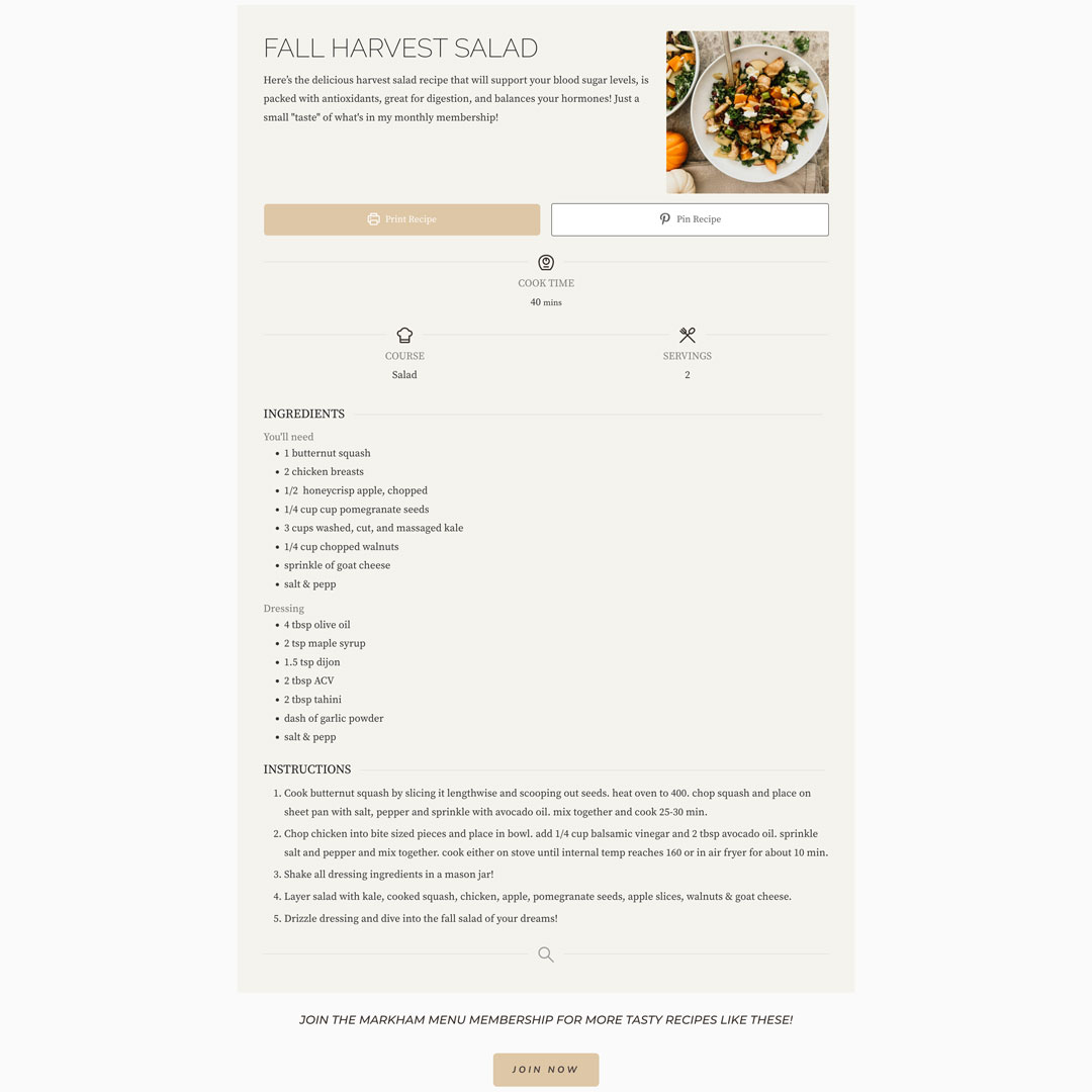
Markham Method is a membership-based website that provides monthly curated whole food, nutrient-dense, hormone-balancing recipes. Instead of cleaning up a half-broken website, I was able to start from the beginning!
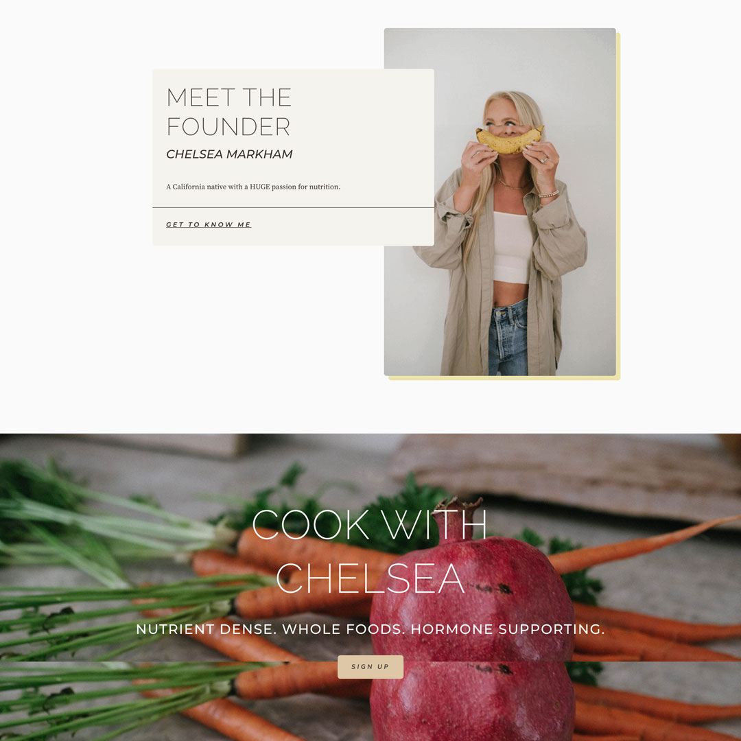
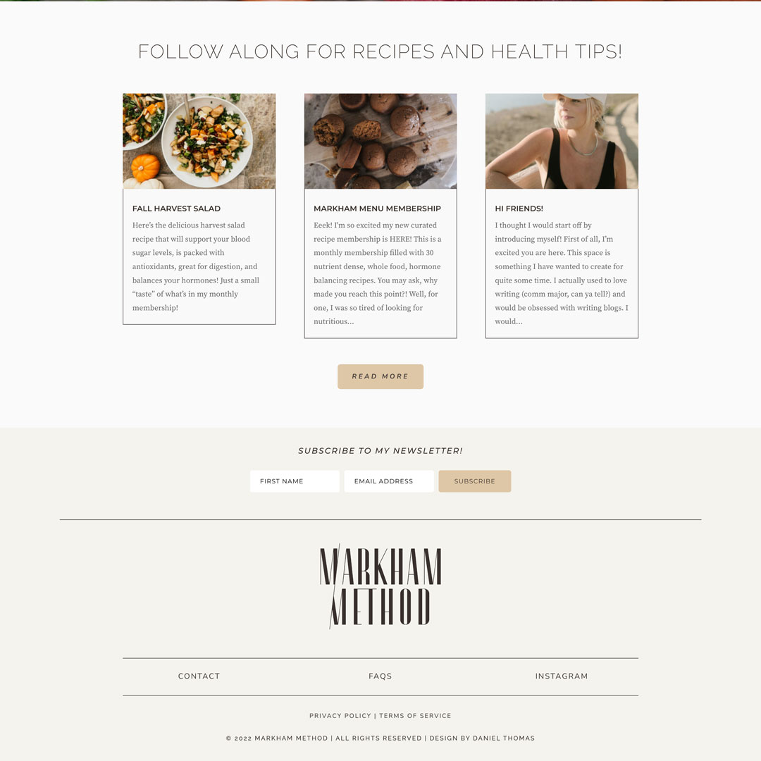
The design and branding process for this project was incredibly smooth. Pulling from the logo itself, I created two more icons specifically for Markham Method to help create a stronger sense of branding continuity. I went with a “thin line” as the main design aesthetic throughout the site, which was also pulled as an idea from the logo. To further support this idea, I went with Raleway as a thin sans-serif font for all the large titles.
Color palettes and how colors mesh are crucial elements of design. During the process, we decided the goal was to make the site feel feminine and representative of the client. Pink was a definite “no”, so we went with warm earth tones highlighted by a minimal splash of a mild blonde-yellow color.
As a designer, the best part of working on a project is piecing all the design elements together to bring the client’s vision to life.
